Griotta
Buying became frictionless. Thinking did not.
- Built and shipped solo
- 23 March 2026
- 1.7.2, 31 August 2026
- Live on iOS
A phone can take a purchase from impulse to confirmed in about four seconds. Saved cards, one-tap checkout, an app already logged in. Every part of that path has been optimised for years.
The deciding has not been optimised at all. It happens in the same few seconds, on the same screen, under the same momentum. The interesting gap is not that people buy things they regret. It is that the buying got faster and the thinking did not, and nothing in the flow puts those two back in proportion.
Budgeting apps arrive after the money has gone. A tracker can tell you what happened last month; it cannot reach the moment that produced it. Griotta is an attempt to work at that moment instead, which means it has to be there before the app opens rather than after the receipt lands.
You choose which apps get a pause. When you try to open one, Griotta arrives first.
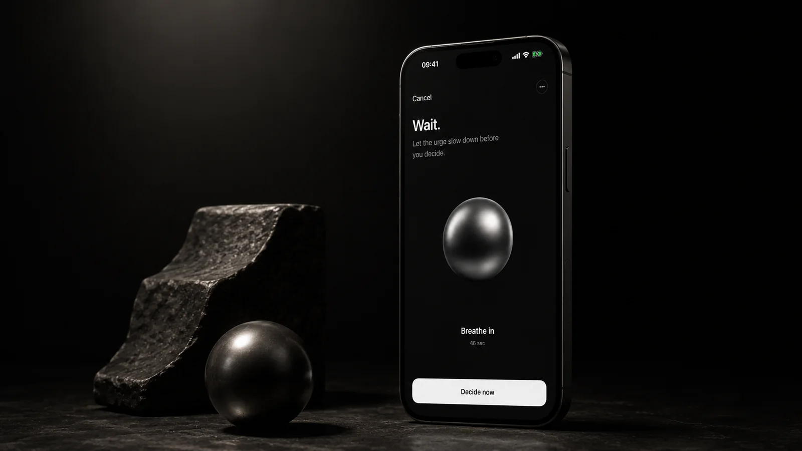
The mechanism is Apple’s Screen Time, used the way a parental control is used, but pointed at yourself and only at the apps you name. Opening a shielded app hands off to Griotta before the app opens. A breathing pause runs for thirty, sixty or ninety seconds, sixty by default. Then you decide.
There is no account, no bank connection and no transaction tracking. Griotta never sees what you bought, or whether you bought anything. That is a constraint on what the product can ever claim about you, and it was chosen deliberately.
Friction is normally the enemy. Here it is the entire product, which means the only question that matters is where it goes.
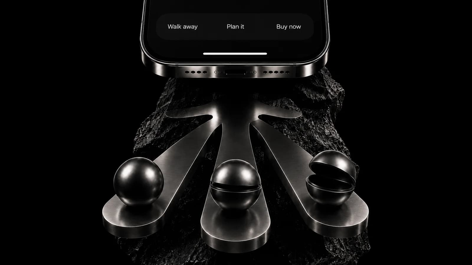
Three outcomes are offered at the end of the pause: walk away, plan it, buy now. They are the same size, in the same colour, with no highlighting and no default. Nothing is styled as the right answer.
That is the hardest decision in the product and the one it would be easiest to get wrong. An app that dims “buy now” is not giving you a moment to think, it is doing the thinking and calling it a choice. Buying is often the correct answer. The product’s job is to make sure the answer arrives from you rather than from the momentum, and then to get out of the way.


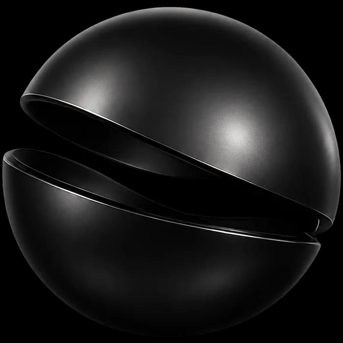
One object carries the whole vocabulary. It is closed when you walked away, part open when you planned it, open when you bought. No badges, no streaks, no score. A streak would make walking away the winning move, and that is exactly the judgement the product refuses to make.
It shipped on 23 March 2026, and most of what happened since has been removal rather than addition.
The first version carried more than the mechanism needed: surfaces for planning, coaching and learning, arranged around the pause rather than serving it. A demolition plan written in July 2026 went through what could be taken out without weakening the thing the product actually does. Most of it went.
In August 2026 the app was renamed. It had shipped as Axyom; version 1.7.2, released on 31 August 2026, introduced the name Griotta and the visual identity that goes with it. The release note put the continuity plainly: the idea stays the same, a little more time before speed makes the decision for you.
Four things, in the order they cost the most.
Friction only works where it is precisely placed.
A pause after you open the app is an annoyance; you are already inside, already looking at the thing. A pause before it opens is a decision point. Same amount of friction, entirely different product. Almost all of the engineering difficulty is in being early enough.
Timing is the feature, not the duration.
Thirty, sixty or ninety seconds are configurable and they matter far less than being in the right place. The number is a preference. The position is the design.
Privacy constraints shape the architecture, not just the policy.
No bank connection and no transaction tracking means the product can never confirm whether a pause changed anything. That rules out the usual proof, and it rules it out permanently. Choosing it means accepting that the strongest available evidence will be weaker than a competitor willing to read your statements.
Fewer features made the mechanism legible.
While the app had planning and coaching surfaces, people described it as a money app and asked where the budget was. Removing them did not make it simpler so much as make it explicable. What it does now fits in a sentence, and the sentence is the product.
Griotta is live on iOS. Free, iOS 17 and later, version 1.7.2.
Two ratings in the French App Store and one in the Korean, both five stars. Every other storefront shows none. At that volume the number is not evidence of anything, and it would be dishonest to present it as traction. There is no download or user figure here because none is published and none should be invented.